


About HealthMap
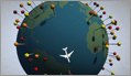
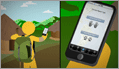
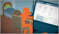
HealthMap, a team of researchers, epidemiologists and software developers at Boston Children's Hospital founded in 2006, is an established global leader in utilizing online informal sources for disease outbreak monitoring and real-time surveillance of emerging public health threats. The freely available Web site 'healthmap.org' and mobile app 'Outbreaks Near Me' deliver real-time intelligence on a broad range of emerging infectious diseases for a diverse audience including libraries, local health departments, governments, and international travelers. HealthMap brings together disparate data sources, including online news aggregators, eyewitness reports, expert-curated discussions and validated official reports, to achieve a unified and comprehensive view of the current global state of infectious diseases and their effect on human and animal health. Through an automated process, updating 24/7/365, the system monitors, organizes, integrates, filters, visualizes and disseminates online information about emerging diseases in nine languages, facilitating early detection of global public health threats.
Download our brochure for more information about HealthMap's initiatives »
Alert Sources
HealthMap's content is aggregated from freely available information from the following sources. Use of their logos or trademarks by HealthMap is intended only to refer specifically to the respective service; it does not imply any endorsement or affiliation.
 ProMED Mail: Program for Monitoring Emerging Diseases, a program of the International Society for Infectious Diseases.
 World Health Organization: The United Nations specialized agency for health.
GeoSentinel: Clinician-based sentinel surveillance of individual travelers from the International Society of Travel Medicine and CDC.
OIE - World Organisation for Animal Health: The intergovernmental organisation responsible for improving animal health worldwide.
 FAO - Food and Agriculture Organization of the United Nations: An intergovernmental organization for ensuring worldwide food quality and agricultural productivity.
 EuroSurveillance: Peer-reviewed European information on communicable disease surveillance and control. Published by the European Centre for Disease Prevention and Control.
 Google News: A commercial news aggregation service provided by Google.
 Moreover: A commercial news feed aggregation service provided by VeriSign.
Wildlife Disease Information Node: A news feed from the Global Wildlife Disease News Map provided by the NBII-Wildlife Disease Information Node at the US Geological Survey.
Baidu News 新闻: A Chinese language commercial news aggregation service provided by Baidu, the number 1 search engine in China.
SOSO Info 资讯: A Chinese language commercial news aggregation service provided by the Chinese search engine Soso.
Software Tools
HealthMap is a Linux/Apache/MySQL/PHP application and relies on the following open products. Special thanks to their authors.
HealthMap also uses Fisher-Robinson Bayesian filtering, as described by Gary Robinson in A Statistical Approach to the Spam Problem.
HealthMap Funding & Support
HealthMap is possible thanks to direct funding from:


HealthMap also acknowledges support from the following organizations:


If you are interested in donating to HealthMap, please complete our Donation Form.
Credits
Icons used in the design of this site attributed to WPZOOM.
By Clark Freifeld and John Brownstein. Copyright ©2007.
This site necessarily relies on publicly available third-party information.
We assume no responsibility for its accuracy or completeness.
Terms of Use